
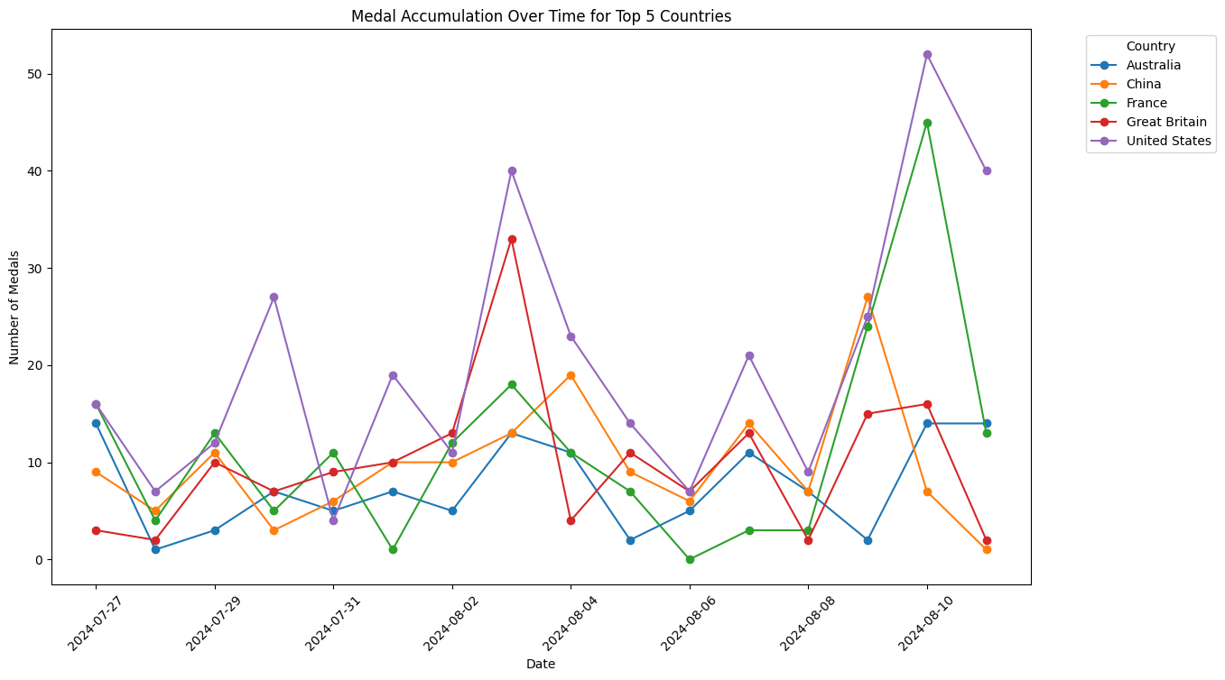
This visualization captures the intense competition between the top 5 countries as they accumulate medals over the course of the 2024 Olympics. Each curve represents the rising tally of medals, showing how quickly some countries surged ahead while others struggled to keep up. The final days of the Olympics saw a dramatic race to secure the top spots, reflecting the dedication and effort of each nation’s athletes.
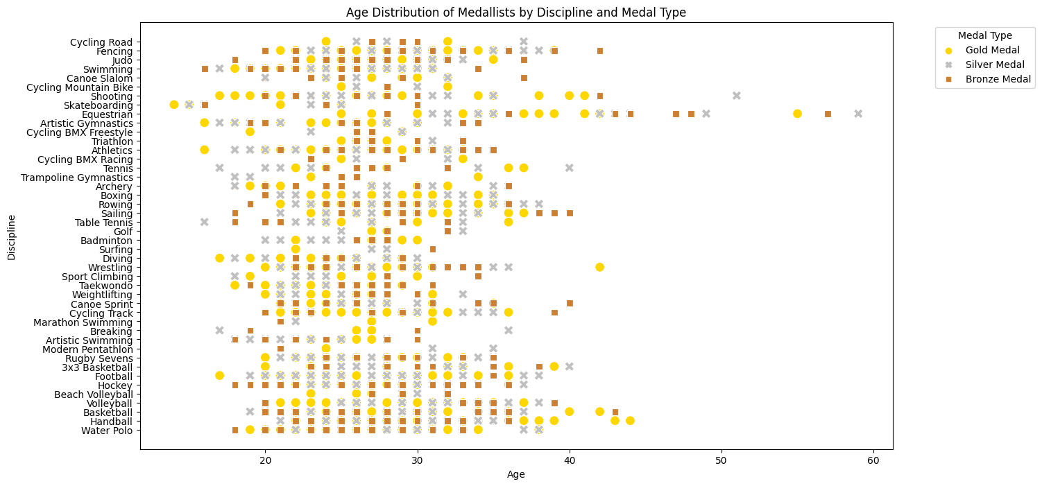
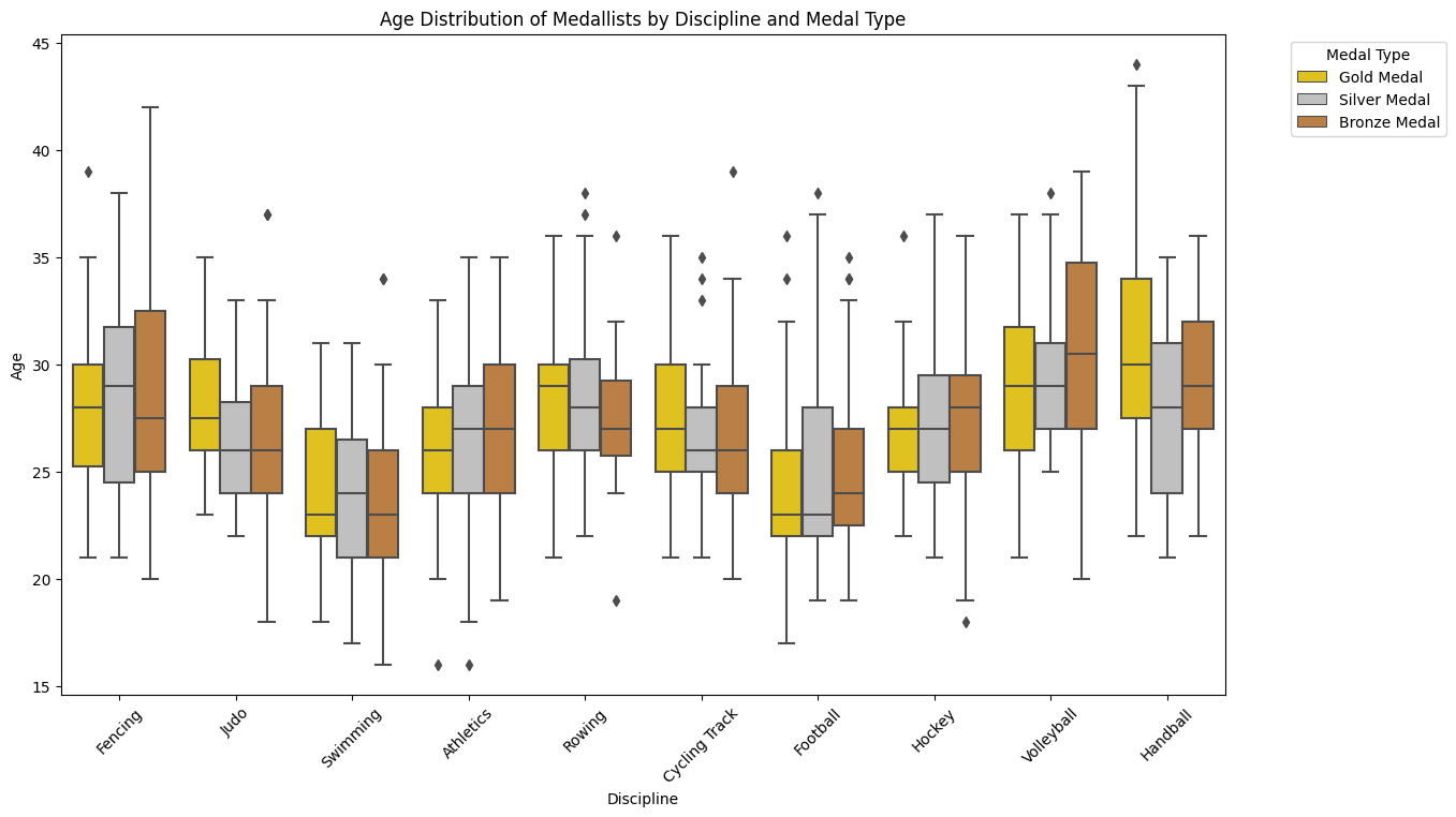
Age plays a crucial role in athletic performance, and this visualization reveals the age distribution of medalists across various sports and medal types. By examining the spread of ages, one can identify patterns, such as the dominance of younger athletes in high-energy sports or the experience of older competitors in technical events. The insights gained from this chart highlight the diversity of athletic talent and the broad age range of those who excel at the Olympic level.
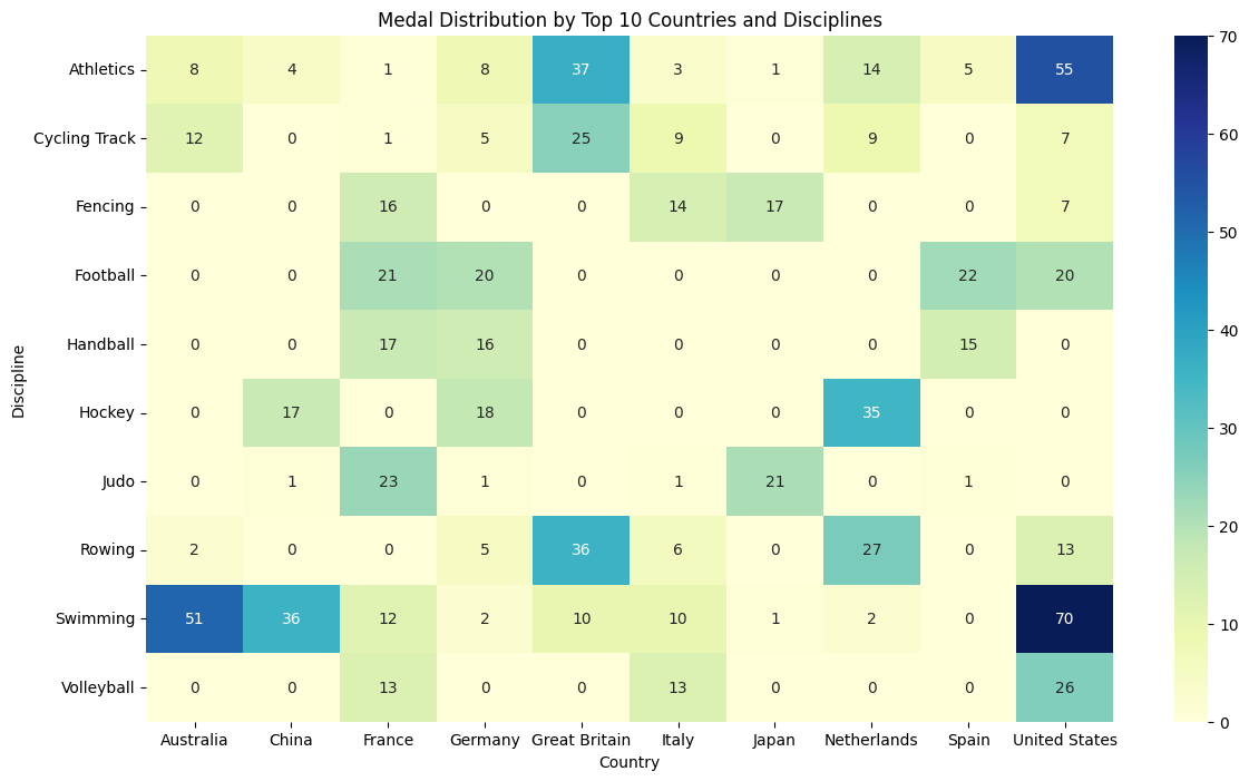
This visualization highlights the distribution of medals among the top 10 countries across various Olympic disciplines. Each country's strengths in specific sports are clearly visible, showcasing their strategic focus and training programs. The chart offers a snapshot of how different nations excel in particular disciplines, contributing to their overall medal tally. It's a testament to the diverse capabilities and specialized training that lead to Olympic success.
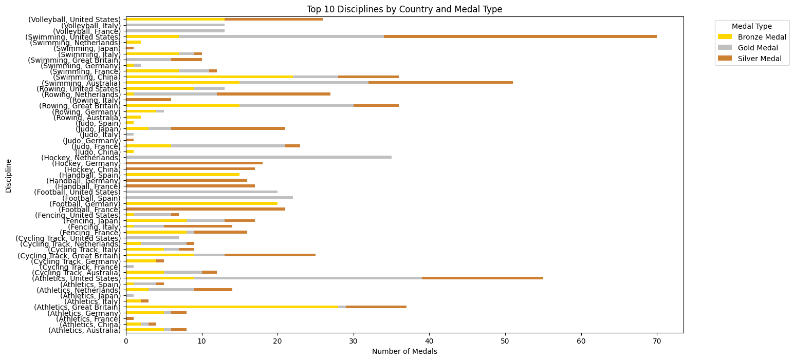
In this visualization, we explore the top 10 disciplines where countries excelled, categorized by the type of medals won. This detailed breakdown not only shows which sports brought the most medals to each country but also emphasizes their dominance in specific events. Whether it’s gold in gymnastics or bronze in swimming, the chart paints a clear picture of national strengths and priorities in the Olympic arena.
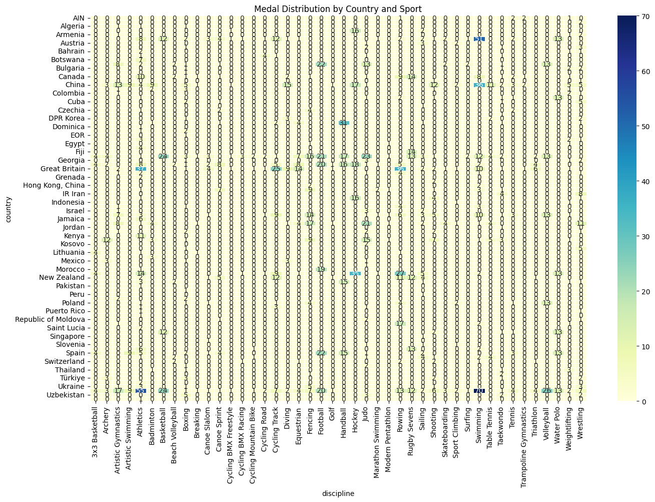
This chart offers a closer look at how different countries performed across various sports, highlighting the unique specialization of each nation. By breaking down the medal distribution by country and sport, we can see where each country focused its efforts and where they achieved the most success. This visualization serves as a powerful tool for understanding the strategic decisions made by each nation in preparing for the Olympics.
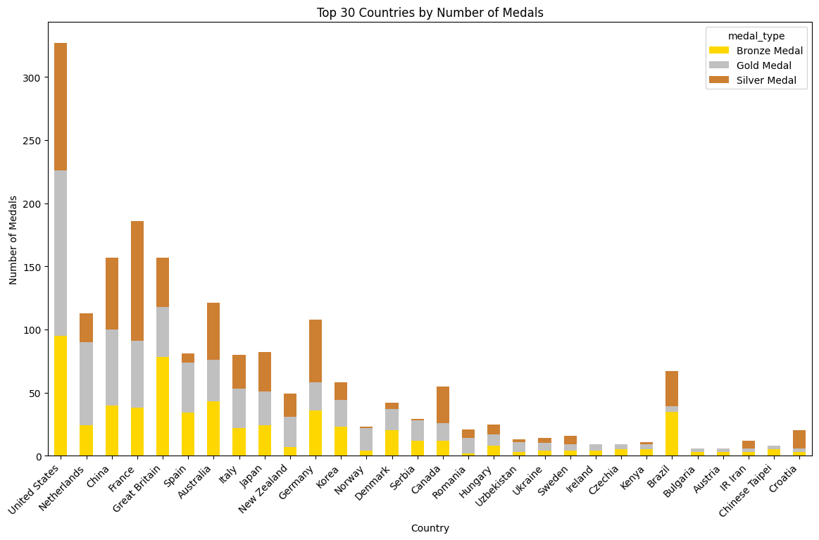
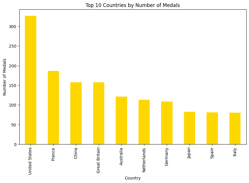
Here we see the top 30 countries ranked by their total number of medals at the 2024 Olympics. This visualization provides a quick overview of the most successful nations, highlighting both traditional powerhouses and emerging contenders. The chart not only showcases overall success but also invites deeper exploration into the factors that contributed to these impressive medal counts.
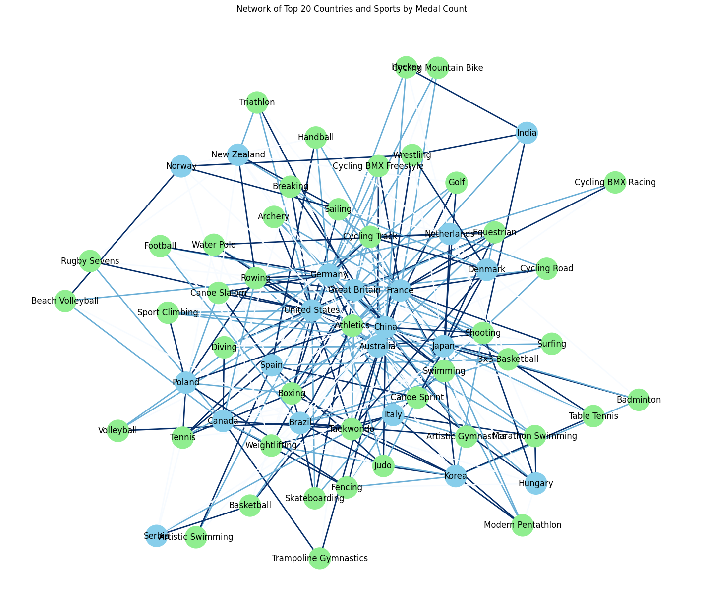
This network visualization connects the top 20 countries with the sports in which they excelled, illustrating the complex web of success at the 2024 Olympics. The interconnected lines between countries and sports reveal patterns of dominance and specialization, offering a unique perspective on how nations leveraged their strengths to achieve Olympic glory. This visual is a compelling representation of the relationships between nations and their favored sports.
.png)
Gender equality in sports is a critical topic, and this visualization sheds light on the distribution of medals between male and female athletes across various disciplines. By comparing the success of men and women in different sports, we can assess progress towards gender balance at the Olympics. This chart is not just a reflection of current achievements but also a call to action for continued efforts towards equality in sports.
History is made every Olympic Games, and this chart compares the medal counts of the 2024 Games with those of previous Olympics. This historical comparison provides valuable insights into how nations have evolved in their Olympic performance, highlighting both consistent champions and those who have made significant strides in recent years. It’s a visualization that tells the story of progress, perseverance, and the relentless pursuit of excellence.
This visualization spotlights the top athletes of the 2024 Olympics, highlighting those who won the most medals. These athletes are not just national heroes but symbols of peak human performance, embodying the spirit of the Games. By focusing on individual achievements, this chart allows us to appreciate the dedication and skill required to stand out on such a grand stage.
Continents compete just as much as countries at the Olympics, and this visualization provides an overview of how medals were distributed across different continents. The chart reveals regional strengths and offers a broader perspective on global competition, showing which parts of the world dominated in various sports. It’s a fascinating look at how geographic and cultural factors contribute to Olympic success.
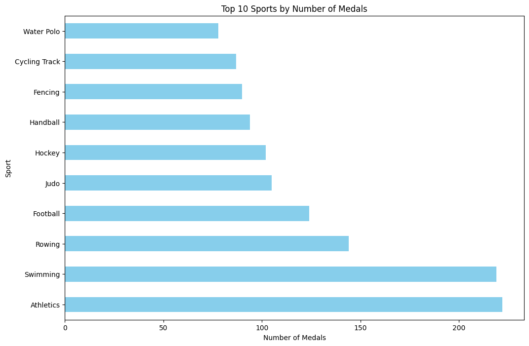
This chart dives into the distribution of gold medals by sport, revealing the disciplines where the competition was fiercest. Gold medals are the ultimate prize, and this visualization highlights where they were won and lost, providing insights into the sports that drew the most intense battles. It’s a powerful representation of the pinnacle of Olympic achievement.
Comparing the ages of gold and silver medallists offers intriguing insights into whether experience or youthful energy prevailed in different sports. This visualization reveals the age dynamics between the top two finishers, providing a nuanced look at how age impacts success in various Olympic events. It’s an exploration of how different age groups bring their unique strengths to the competition.
.png)
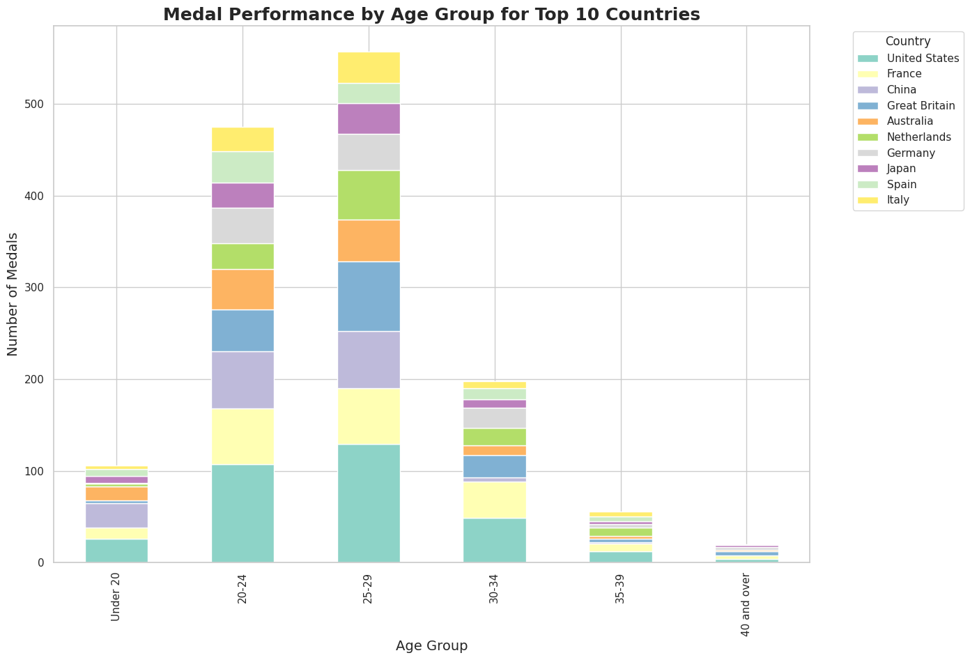
This visualizations focuses on the medal count by sport for the top 10 countries, breaking down their achievements across different disciplines. By analyzing this data, we can see which sports were the strongest for each nation and how they contributed to the overall success of their Olympic campaign. It’s a detailed look at the diversity of excellence displayed by the leading countries.